How to make a line graph in google sheets in 3 quick steps!
If you’re wondering how to make a line graph in Google Sheets, it’s important to understand that every now and then, you might get some hefty data that requires presentation to the public, your boss, or someone else.
Now, you can report your data as it is, as tables with numbers, but it won’t, at all, be appealing to your audience and may confuse or bore them. Reporting large data in tables is not the best option to go by, and to present such data your best option would be to use the pictorial representation path, using charts and graphs, which are designed to give your data clarity and to make your audience perceive your data visually, and also if required, give them context and comparisons.
The creation of such pictorial figures is very easy when you’re working on Google Sheets. So, if you want to know how to make a line graph in Google Sheets, keep reading!
Let’s go over the simplest ones of such pictorial figures, and understand and learn how to make a line graph in google sheets.
Every now and then, you might get some hefty data that requires presentation to the public, your boss, or someone else. Forming an extensive Google Docs document would not cut out as an efficient presentation.
You can even report your data as it is, as tables with numbers, but it won’t at all be appealing to your audience and may confuse or bore them. Reporting large data in tables is not the best option to go by, and to present such data, your best option would be to use the pictorial representation path, using charts and graphs, which are designed to give your data clarity and to make your audience perceive your data visually, and also, if required, give them context and comparisons.
The creation of such pictorial figures is very easy when you’re working on Google Sheets, including how to make a line graph in Google Sheets. Hence when you need to make a good impression on your boss or the public, toss out that Google Docs file. Head over to your Google Sheets and make eye-catching charts and graphs.
Let’s go over the simplest ones of such pictorial figures and understand and learn how to make a line graph in google sheets.
Contents
What is a line graph?
A line graph is a great way to represent trends and show the relationship between two variables in your data. To create a line graph in Google Sheets, you can use the built-in chart editor. First, select the data you want to include in your graph.
Next, click on “Insert” in the top menu, and then click on “Chart”. This will open up the chart editor, where you can customize your graph’s appearance and format. Under “Setup”, you can choose the “Chart type” and select the line graph option.
Structure of a line graph:
The basic structure of a line graph, like most other graphs, is constituent of two perpendicular lines; one of these is called the x-axis and lies horizontally, whereas the other one stands vertically and is called the y-axis. The two axes have the entire data scales graduated onto them and the data values are then marked against the scales in the central blank region. The dots are then connected to produce line graphs.
Example of the line graph:
The following graph is an example of a line graph.
What are line graphs used for?
If you’re wondering how to make a line graph in Google Sheets, it’s important to understand that line graphs are typically used to represent trends. Within the domain of trends, however, there are many uses of line graphs as well. These include demonstrations of increases, decreases, occurrences, and more.
Data on a line graph usually occurs because of two variables interacting with each other, which may or may not be existent over a changing time as trends (to show the relationship between two variables); these graphs can, also, be a representation of a single changing quantity or variable being represented with a line graph (to show trends of or changes in one variable).
Now that we’ve discussed what line graphs are and what they’re used for, let’s dive into how to make a line graph in Google Sheets.
How to make a line graph in google sheets?
Making a line graph is one of the easiest things to do for visual data representation on google sheets.
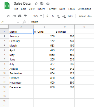
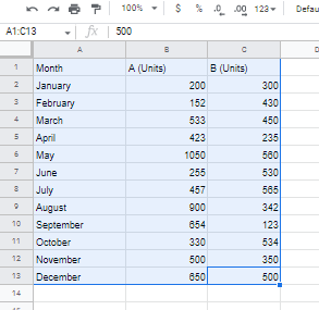
Let us consider the following representation of sales of product A and product B in units as our example data of a Google Sheet file.
Making a simple line graph with one data set:
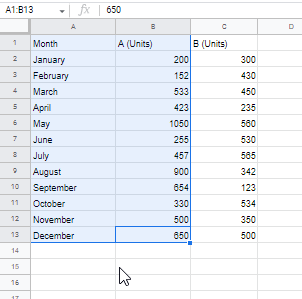
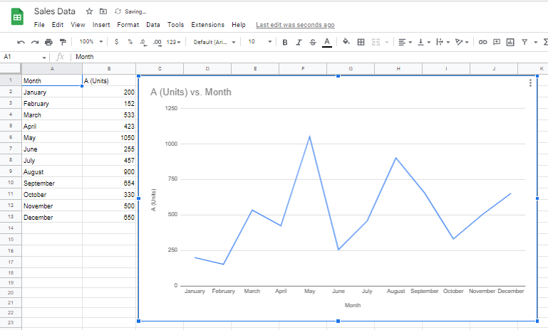
Let’s first make a simple line graph that reflects the sale of only one product i.e., Product A in the document file.
Step 1:
The first thing that you have to do to make a line graph is to select your data.
Step 2:
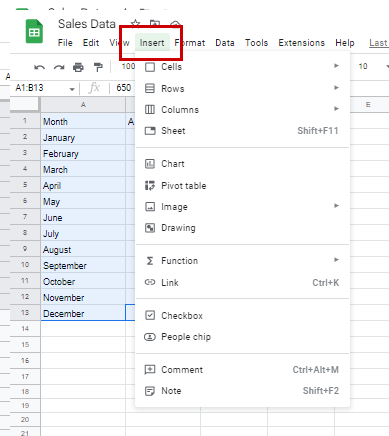
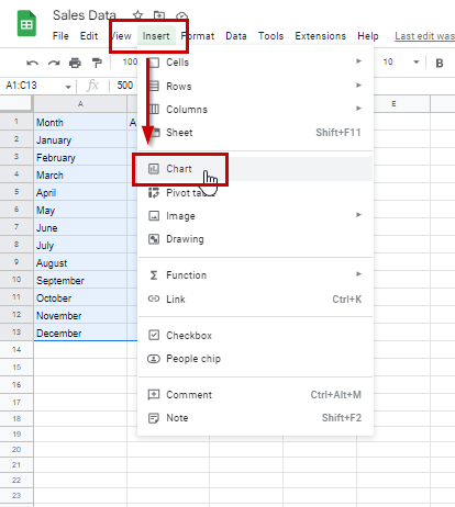
Now, go to the menu bar and from there, click on “Insert”. A drop-down menu will appear.
Step 3:
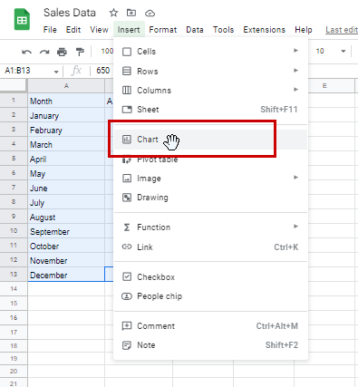
From this drop-down menu click on “Chart”.
Once you click on “Chart”, your line graph will appear.
There a lot of ways in which you can customize this line graph of yours, but we’ll discuss it after the next step which is learning how to make a line graph in google sheets with multiple data ranges e.g., data of two products i.e., product A and B.
Making a line graph with multiple data columns:
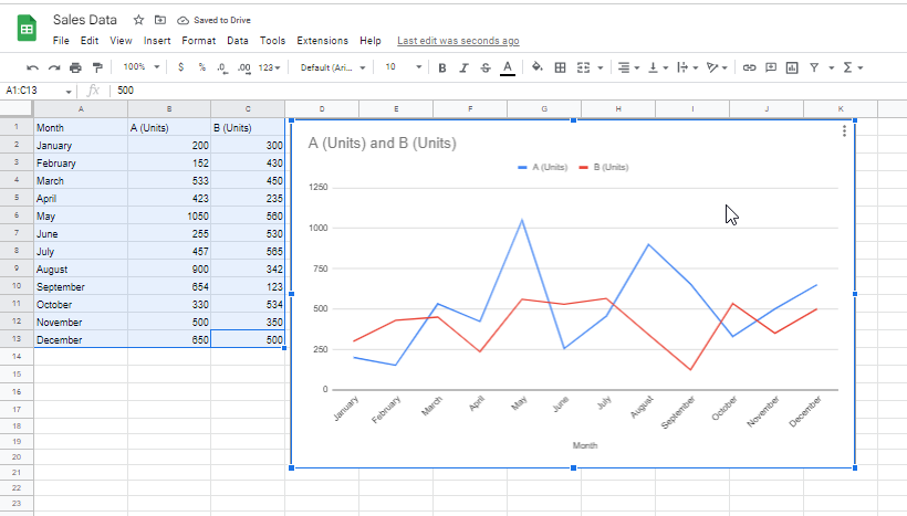
For this, too, you have to follow the same steps as were followed for the single data column graph. The only difference is that you will select your entire data.
After selection, go to “Insert”, and then “Chart”
Your line graph will now appear.
Now that we have went over on how to make a line graph in google sheets, lets discuss how to customize and edit one after we have made it.
Customizing your line graph:
Along with learning how to make a line graph in google sheets, it is also essential to know how to customize it. Customization of your google sheet’s’ graphs is very simple and easy. We will discuss the customization of every step separately.
“Setup”:
First off, we will talk about the general set up of the graph. For this, double click on any blank space on the graph. Clicking on it will make a settings section pop up on the right side of your screen.
Chart type:
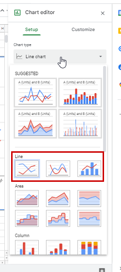
Under “Setup”, the first option is for “Chart type”. This allows you to choose the perfect type of chart for visual data representation and gives you a range of options such as line graph, bar graph, pie chart etc. We will stick with the line graph. However, even with line graphs, there are 3 types of graphs offered by google sheets. You can choose from a regular (pointed corners) line graph, a smooth (rounded corners) line graph, and a combination or combo graph combining a line graph and a bar graph.
Data Range:
If you want to make a line graph in Google Sheets, the next step is to adjust the “Data Range” option. This option allows you to select the range of cells containing the data you want to use for the graph. Since we already selected our data perfectly, it has already been updated in this section. However, if you want to add another column, for example, data on the sale of another product, then you can add it in the spreadsheet and update your graph by using this section. This is a useful feature as it allows you to add more data to your existing graph without having to create a new one from scratch.
X-axis:
This subsection allows you to choose which column will be graduated on the axis and to have the other data measured against it. The “Month” here represents the top title cell of the column selected. This is the X-axis label.
The aggregate feature groups the same data points on the axis as one. Since we’re taking the 12 months of the year, this does not apply here but if you had daily sale data for three months and you wanted your graph to group each day of each month together, for example, 1st of each month serving as one and first point on the x-axis, then you would want to check the aggregate option.
Series:
Series simply marks/defines the ranges being represented as lines in the graph in a Google Sheet document file.
“Customization”:
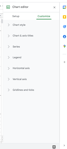
Next to the “Setup” section is the “Customization” section. This, too, offers a range of options, and we will go over each one of those.
Chart Style:
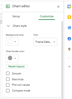
“Chart style” offers a series of settings that relate to the aesthetic aspect of the chart. Basically, it is your chart editor. Here, you can select the background color and line colors, and font size of the chart.
The four checkboxes at the end of this section allow you to smoothen the edges of your lines, to maximize or zoom of the chart, which maximizes the chart against the border of the defined region, to include null point data in your graph, and to compare your data points when you hover over a point on the line, against other data mentioned in the range.
Chart & axis titles:
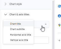
On the top of this subsection, you get the option to choose from one of four heading types.
From these four you can select any one chart title type, and then customize it in terms of content, font, font size, format, and color.
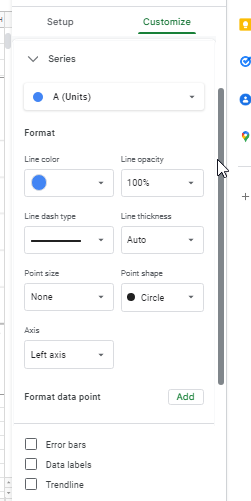
Series:,
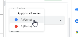
In this series section as well, on the top you get to choose which series of representations of data set you want to customize.
Select a series, and the options below will let you control all its features, from line thickness and opacity to color.
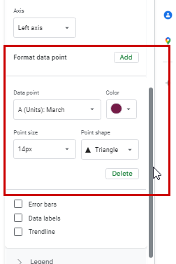
Here, you can also customize a single data point if you want to highlight it for any reason. For this, first, select the data point from the “Add” option under “Format data point” and then you can customize it in terms of shape, color, and size.
There are three check boxes in the end.
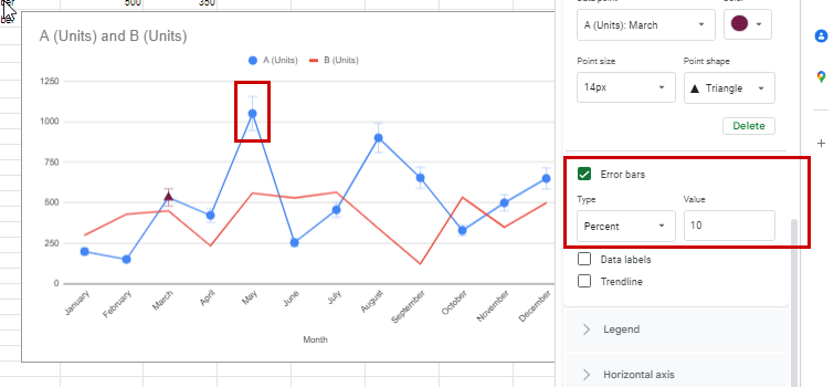
1. “Error bars” displays error bars on each data point to convey margins for errors. You control the margin ranges.
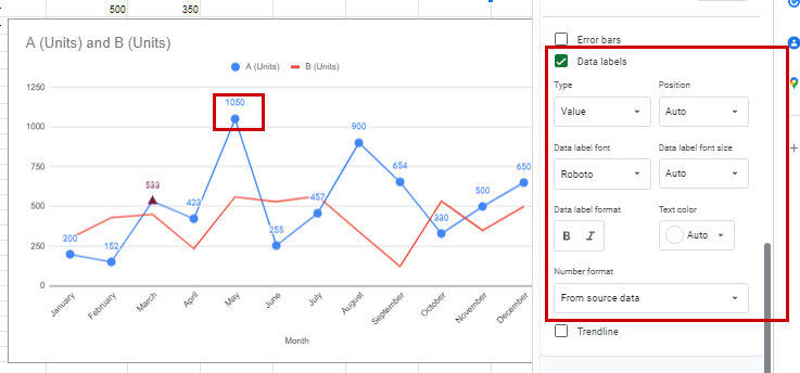
2. “Data Labels” simply marks labels on the data points, as values mentioned in the table, on the graph.
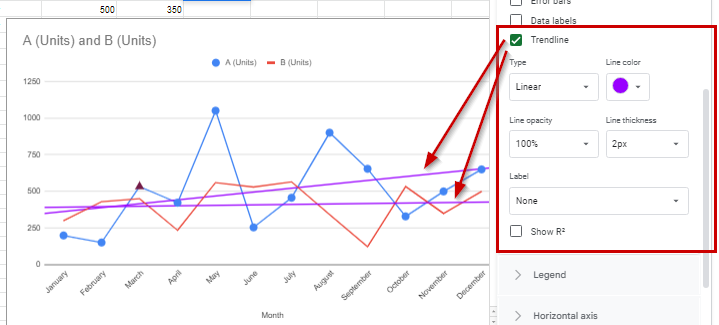
3. “Trendline” shows trends, with the line being customizable. R2 refers to the regression in the data and checking this box will have the regression value showing up next to the legends.
Legend:
Legend refers to the titles of the two lines and shows the colors and the data sets the lines in the line graph represent.
Horizontal axis and Vertical axis:
These allow you to control your axes, their visuals, and also to mark their titles.
Gridlines and ticks:
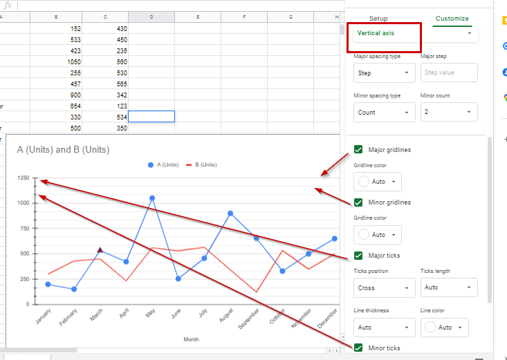
For gridlines and ticks in a line graph created in Google Sheets, first, you need to select your axis from the top. After that, you get a series of options to define your axis’ characters, such as spacing and markings.
To customize your line graph even further, you can also turn on or off your gridlines and ticks. Gridlines refer to a simple grid in the background of the graph. This is an amazing option if you have lots of data being represented in your graph.
You can have either or both – major gridlines and minor gridlines. Ticks refer to small markers on the axes that represent graduation. You can have either or both – major and minor ticks.
The following image shows the line graph with both types of ticks and both types of gridlines activated, only for the vertical axis.
Tip:
If you want to change your data at any point, all you need to do is to edit it in your defined data table and the graph will be updated automatically. Hopefully, you are now full versed on how to make a line graph in Google Sheets.
h/t: How to Geek

